Announcement

Collapse
No announcement yet.

Fans Submit Logos for 2020 Ogres

Collapse
X
 
  • Filter
  • Time
  • Show
Clear All
new posts

  • Fans Submit Logos for 2020 Ogres

    Tired of a logo that most can barely see?

    Can't find the PR image anywhere?

    Concerned that Lansing has sold out to Dreamworks Studios to put Shrek on the helmet.

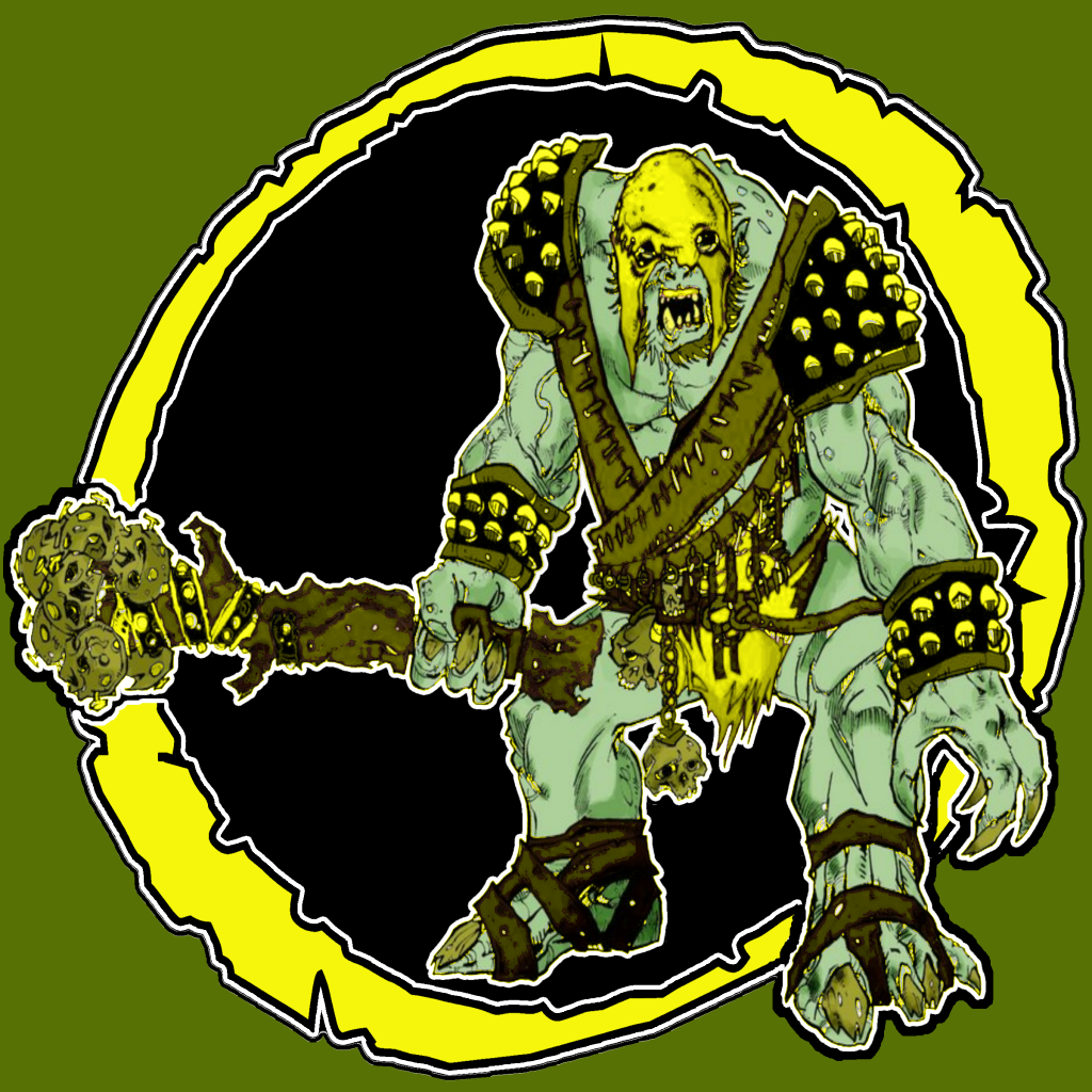
    View the unsolicited logos submitted at the league office this week.


    (ok..so I was a little bored today and had to be inside with the rain.)
    MIAMI VICE - 2074

  • #2
    I think they are all have a little too much going on to make a good helmet logo. The D&D Ogre is probably best. Bachelor #2 looks like a drag queen. #3 doesn't have enough attitude for my tastes. As to #4 if I didn't like that one I wouldn't have it tattooed on my taint would I?

    If it was my team I'd go simple an 'O' or 'L' with a club. Or maybe just the club.

    Comment


    • #3
      lol...#3 is as close as I could even find to a logo...agreed...he's not very intimidating. #4 is my favorite but way too busy!

      ooo...I like the idea of a club inside an O.
      MIAMI VICE - 2074

      Comment


      • #4
        Originally posted by Argot View Post

        ooo...I like the idea of a club inside an O.
        That's what she said....ZING!

        Comment


        • #5
          nice.
          MIAMI VICE - 2074

          Comment


          • #6
            think outside the box a bit..embrace the green..and put an ogreish bloody hand print on the helmet..

            sigpic

            Comment


            • #7
              I really like that green helmet with the black face mask. If Lansing doesn't want it could you marry it to this:


              Uploaded with ImageShack.us

              Comment


              • #8
                Originally posted by Hoosier View Post
                think outside the box a bit..embrace the green..and put an ogreish bloody hand print on the helmet..

                I like the concept...not digging the child's hand tho...I imagine an Ogre's hands are bigger?? And we might be confusing Orcs and Ogres....at least it's not a white hand.
                MIAMI VICE - 2074

                Comment


                • #9
                  Ogres eat babies and kids, right?
                  [Vito]Stallion
                  Dir. Football Ops
                  Lansing Ogres
                  2030 Imperial League Champions
                  _____
                  RING OF HONOR:
                  RB James Tart [HOF], WR Grady Gomez, QB Nigel Booker, OLB Stephen Srait

                  Comment


                  • #10
                    Would lean towards any helmet that keeps an ogre on it. Not a fan of just a letter on the helmet.


                    NC North Champs: 2020

                    Comment


                    • #11
                      Replace the dice with a football on the first one and you may have something
                      Current GM Fresno Warthogs
                      Former GM Cleveland Clawz - 2018 IFL Champions

                      RNFL - Washington Redskins
                      OSFL- Boston Drunken Fightin' Irish
                      CyFL - Miami Dolphins
                      PFL - New England Patriots

                      Comment


                      • #12
                        Originally posted by Mike17 View Post
                        Replace the dice with a football on the first one and you may have something


                        sigpic

                        Comment


                        • #13
                          Not sure if that one is big enough for Jester's logo page.

                          I like the sig, Actually you forgot the Los Angeles Americans/Liberty which is a pain to reduplicate.
                          MIAMI VICE - 2074

                          Comment


                          • #14
                            Even if it was duplicated I'm guessing that design would look bad on the boxier helmets.

                            I think the full on side view looks better than the tilted view. Anyone agree? I'd prefer the art work didn't get chopped.

                            Comment


                            • #15
                              Here's a link to the LR logo I like. Looking to get half way or so to the Northies for now. Easy on the lavendar though.

                              http://marketing.lr.edu/logo-central/web

                              The original Northern looked like this:


                              Uploaded with ImageShack.us

                              Comment

                              Working...
                              X